Monday, June 18, 2018

Bleed


Bleed refers to objects that extend beyond the edge of the printed page. This page tells you why bleed is needed, how much is needed and how to fix issues with bleed.
For an example of the use of bleed, look at the image below. The picture of the monkey and the gray rectangle go beyond the edge of the page. They ‘bleed off’ the edge of the paper.
image bleed example on a page
Full bleed means that an image extends beyond the edge of the page on all four sides.

Why do you need to add bleed?

1. Once a job has been printed, the press sheets need to be folded, bound and trimmed. For each of these finishing steps, there is a certain margin of error. Bleed makes it easier to avoid issues with:
  • mechanical limitations
  • the behavior of the paper when running at high speed through a machine
  • operator errors
2. When a press sheet is folded multiple times, the thickness of the paper causes the inner pages to gradually shift. This is called creep or shingling.
shingling or creep and bleed
To compensate for this effect, the entire content of pages is shifted slightly to the left or right, depending on production needs and the design of the content. To be able to move pages, you need the content to extend a bit beyond the trimmed page size.
3. Paper is an organic material which may shrink when it is subjected to humidity and mechanical stress.

What happens if no bleed is used?

If the page content exactly fits the page itself, such errors could cause a thin white line to show at one of the edges of the page. To avoid such lines, the design elements have to extend beyond the trim edge of the page.
Actually all the reasons why bleed is needed also explain why small design elements should not be positioned too close to the outer edges of the document. If a small page number is put right at the edge of the page and that page is trimmed incorrectly, the page number may simply get cut away.

How much bleed is needed?

Generally, the bleed amount is set to 3 millimeters or 1/8 of an inch. Many prefer a bit more bleed – 5 millimeters – especially for large books, thickish paper or jobs with many sections.
Bleed requirements can be different from one printing company to another and from one job to another. Contact your printer in case of doubt or look up their recommendations on their website. Once the design of a job has been finalized, modifying bleed can be a real hassle so it is better to start off using the correct value.
The fact that content needs to extend beyond the page boundaries is no excuse for sloppy design. Letting images extend beyond the needed bleed clutters the file, can lead to bloated PDF files and simply looks sloppy. The prepress systems used at the printing company can trim any excessive bleed but why cause problems that are so easy to avoid?
To make a designer’s life easy professional design applications like Adobe InDesign allow you to specify the amount of bleed that is needed. This will be shown as an extra guide around the page.
indesign bleed
Some applications allow you to crop images to their image frame when creating a PDF. In InDesign, this option is called ‘Crop Image Data To Frames’ in the Compression tab of the PDF Export window. Activating this option makes the resulting PDF file smaller but it also makes it very difficult for a prepress operator to tweak bleed settings afterward if you didn’t use (enough) bleed.

How to edit bleed or add it to a document?

Not all applications support bleed and not all designers are aware of the need to extend content beyond the page edge.
  • Changing bleed in native files is the easiest, as long as you have the matching application at your disposal.
  • For PDF files, things are a bit more difficult:
    • First of all the bleed box may need adjusting.
    • As long as it are simple objects that need to bleed, using an editor like PitStop to edit a PDF is a lot of work but still doable. Using the Position window you can alter the dimensions of rectangles.
    • As soon as images are involved, things get more difficult. Sometimes pictures have a clipping path applied to them and removing or changing it using a plug-in like PitStop might do the trick. More information can be found in this B4print forum thread.
    • Some of the more powerful (and costly) editing tools like EskoArtwork PackEdge have sophisticated bleed editing tools.
  • Sometimes the only solution is to enlarge all pages a tiny bit (101%) to make their content extend beyond the trim size.
  • In some cases, typically very short run digital jobs in which cost is a major factor, a printer might decide to undercut the job. The fact that this makes the pages smaller than they should be is not always an issue.
Source: https://www.prepressure.com/design/basics/bleed?utm_campaign=InternalLink&utm_medium=PopularPages&utm_source=Bleed

Bitmap versus vector graphics

Digital images can usually be divided into two distinct categories. They are either bitmap files or vector graphics. If you work in prepress, you need a good understanding of the advantages and disadvantages of both types of data. These pages try to explain the differences.
  • As a general rule, digital pictures and scanned images are bitmap files. These are sometimes also called raster images.
  • Drawings made in applications like Adobe Illustrator or Corel Draw are saved as vector graphics.
Technically both data formats are completely different. The end result, however, can look virtually identical in either format. As a general rule bitmaps are typically used to depict lifelike images whereas vector graphics are more often used for abstract images such as logos. There are however numerous exceptions to this rule. It is often impossible to determine whether an image is a bitmap or a vector file just by looking at it.
  • Vexel art, for instance, are bitmap images that have been manipulated to look as if they are vector data.  The technique is used to create attention-grabbing realistic images that have an artificial and sharpened look to them.
  • Talented artists like Yukio Miyamoto can draw photorealistic images using vectors.
A photorealistic image created using Illustrator
Photorealistic vector art from Yukio Miyamoto
You can convert a bitmap image into a vector file. A vector image can be transformed into a bitmap. There are even file formats that can combine both types of data into a single file.

Bitmap images

Bitmap images are exactly what their name says they are: a collection of bits that form an image. The image consists of a matrix of individual dots (or pixels) that all have their own color (described using bits, the smallest possible units of information for a computer).
Let’s take a look at a typical bitmap image to demonstrate the principle:
Example of a bitmap image
To the left you see an image and to the right a 250 percent enlargement of the top of one of the mountains. As you can see the image consists of hundreds of rows and columns of small elements that all have their own color. One such element is called a pixel – short for picture element. The human eye is not capable of seeing each individual pixel so we perceive a picture with smooth gradations.
The number of pixels you need to get a realistic looking image depends on the way the image will be used. One of the next pages goes into more detail on this.

Types of bitmap images

Bitmap images can contain any number of colors but there are four main categories:
  1. Line-art. These are images that only contain two colors, usually black and white. Sometimes these images are referred to as bitmaps because a computer has to use only 1 bit (on=black, off=white) to define each pixel.
    Example of a lineart image
    Example of a lineart image
  2. Grayscale images, which contain various shades of gray as well as pure black and white.Typically 256 shades of gray (8-bit) are used even though the human visual system needs only 100 tints to perceive an image as life-like.
    Example of a greyscale image
    Example of a grayscale image
  3. Multitones: such images contain shades of two or more colors. The most popular multitone images are duotones, which usually consist of black and a second spot color (often a Pantone color). The example below contains black and Pantone Warm Red.
    Example of a duotone image
    Example of a duotone image
  4. Full-color images. The color information can be described using a number of color spaces: RGB, CMYK or Lab for instance.
Example of a color image

Characteristics of bitmap data

Bitmap data can take up a lot of room. A CMYK A4-size picture that is optimized for medium quality printing (150 lpi) takes up 40 MB. Compression can reduce the size of the file.
The image with the enlargement showed one of the main disadvantages of bitmap images: once they are enlarged too much, they look unnatural and blocky. Reducing their sizes also has an impact on image quality as images lose a bit of sharpness.
Bitmaps are fairly simple to output, as long as your RIP or printer has sufficient memory.

Applications that can handle bitmap data

There are hundreds of applications on the market that can be used to create or modify bitmap data. In prepress, one application – Adobe Photoshop – completely dominates the market. This doesn’t mean that cheaper alternatives like Corel Photo-Paint, should be disregarded.

File formats that are used for bitmap data

Bitmap data can be saved in a wide variety of file formats. Among these are:
  • BMP: an outdated and limited file format that is not suitable for use in prepress.
  • EPS: a flexible file format that can contain both bitmap and vector data. It is gradually being replaced by PDF.
  • GIF: mainly used for internet graphics
  • JPEG: or rather the JFIF file format, which is mainly used for internet graphics
  • PDF: versatile file format that can contain just about any type of data including complete pages, it is not yet widely used to exchange just images
  • PICT: a file format that can contain both bitmap and vector data but that is mainly used on Macintosh computers and is not very suitable for prepress.
  • PSD: the native file format of Adobe Photoshop (which can also contain vector data such as clipping paths)
  • TIFF: a popular and versatile bitmap file format

Vector graphics

Vector graphics are images that are completely described using mathematical definitions. The image below shows the principle. To the left, you see the image itself and to the right, you see the actual lines that make up the drawing.
Example of a vector based image, drawn using bézier curves
Example of a vector image
Each individual line is made up of either a vast collection of points with lines interconnecting all of them or just a few control points that are connected using so-called Bézier curves. It is this latter method that generates the best results and that is used by most drawing programs.
Example of a bezier curve
To the right is an example of using Bézier curves
This drawing demonstrates the two principles. To the left, a circle is formed by connecting a number of points using straight lines. To the right, you see the same circle that is now drawn using 4 points (nodes) only.

Characteristics of vector drawings

Vector drawings are usually pretty small files because they only contain data about the Bézier curves that form the drawing. The EPS file format that is often used to store vector drawings includes a bitmap preview image along the Bézier data. The file size of this preview image is usually larger than the actual Bézier data themselves.
Vector drawings can usually be scaled without any loss in quality. This makes them ideal for company logos, maps or other objects that have to be resized frequently. Please note that not all vector drawings can be scaled as much as you like:
  • Drawings containing trapping information can only be scaled up to 20 percent larger or smaller.
  • Thin lines may disappear if a vector drawing is reduced too much.
  • Small errors in a drawing may become visible as soon as it is enlarged too much.
It is fairly easy to create a vector based drawing that is very difficult to output. Especially the use of tiles (small objects that are repeated dozens or hundreds of times) and Corel Draw lens effects can lead to very complex files.

Applications that can handle vector data

There are hundreds of applications on the market that can be used to create or modify vector data. In prepress, Adobe Illustrator and Corel Draw are the most popular programs.

File formats that are used for vector data

Bitmap data can be saved in a wide variety of file formats. Oddly enough the most relevant formats for the printing industry are also capable of storing bitmap information:
  • EPS: the most popular file format to exchange vector drawings even though PDF is quickly gaining ground.
  • PDF: a versatile file format that can contain just about any type of data including complete pages.
  • PSD: the native file format of Adobe Photoshop.
  • AI: the native file format of Adobe Illustrator.

How to convert bitmap data to vector data and back

It is sometimes necessary to transform images from bitmap data to vector data or back. Some possible uses include:
  • If you scan or photograph a logo, it is a bitmap image. If it is going to be used often in a layout it is more practical to have that logo as a vector drawing. That reduces its file size and you can change the image size without worrying about any loss in quality.
  • Vector drawings often have to be converted to bitmaps if they will be used on a web page.
  • Vector drawings are sometimes too complicated for a RIP to be output on film or plate. Converting them to a bitmap simplifies the file.
Luckily it is fairly easy to convert images from one mode to the other:
  • From bitmap data to vector graphics: the process to convert a bitmap image to vector data is called outlining or vectorizing. Some drawing applications such as Adobe Illustrator and Corel Draw have this option built in. There are also separate programs available to vectorize bitmap images. For simple jobs the easiest solution is to put the bitmap image on the background of the canvas of a drawing application and manually draw over it.
  • From vector graphics to bitmap data:
    • Many drawing applications can store vector data as bitmap files as well (usually this option is hidden in the Export menu option).
    • You can always view a vector file on screen, then take a screen capture and save this screen capture as a bitmap image.
    • Photoshop can open some vector file formats and rasterize the file so that it becomes a bitmap file. A pop-up menu allows you to define the resolution and color mode of the bitmap data.
Source: https://www.prepressure.com/library/file-formats/bitmap-versus-vector?utm_campaign=InternalLink&utm_medium=PopularPages&utm_source=BitmapVsVector

The history of fonts

This page documents how font formats evolved from the early 80’s onwards. The entire graphic arts industry changed dramatically when Adobe developed PostScript and the Macintosh, LaserWriter and PageMaker came to market. Separate pages go into more detail on the history of PostScript or the history of prepress.

The early years

When Adobe launched PostScript in 1984, it supported two different types of fonts: Type 1 and Type 3. Of these two, Type 1 was the more sophisticated format. It supported hinting, a technique to improve the output quality on lower resolution devices or at smaller font sizes and it also supported a more efficient compression algorithm of font data. The Type 3 specs offered some functionality that was not present in Type 1 but it was clearly a less sophisticated format.
Adobe kept the specification for Type 1 fonts for itself. They build an entire library of Type 1 fonts that customers could buy. Every PostScript output device included 36 of these fonts which in those days when fonts were still expensive compensated somewhat for the steep price of PostScript printers.
The specifications of Type 3 fonts were published and soon tools to create Type 3 fonts emerged. Type foundries like MonoType released entire libraries of Type 3 fonts. The fact that Adobe kept the superior font format to itself made all of these companies very angry but at the same time PostScript became a runaway success that led to a much larger market in which everyone could sell fonts.
Not content with controlling the market of output devices, Adobe developed a version of PostScript that could run (albeit slowly) on personal computers so these could visualize PostScript data on-screen. This technology was christened Display PostScript.

The font wars of the early nineties

Adobe offered Display PostScript to both Apple and Microsoft but both companies were reluctant to give another company control over a vital part of their operating system. They were also unwilling to pay the stiff royalties that Adobe demanded. Realizing that they both shared a common problem, Apple and Microsoft decided to join forces. Apple would provide a font technology while Microsoft would come up with an imaging technology, similar to PostScript.
Apple engineers had already been working on several vector font technologies during the late 80’s. Lead engineer Sampo Kaasila came up with a very promising scalable font technology codenamed Bass (because  you can also scale a fish). This was first renamed to Royal and later to TrueType before being exchanged with Microsoft in 1991.
The Microsoft printer engine was named TrueImage. It was buggy and since both Apple and Microsoft didn’t really need it, it never showed up in any of their products. The TrueImage RIP did get used in Aldus TrapWise and when that company was later acquired by Adobe, Adobe ended up selling a product that featured a fairly unreliable PostScript clone-RIP.
Apple made TrueType an integral part of System 7 while Microsoft added TrueType support to Windows 3.1 in early 1992. Adobe responded to the TrueType threat by releasing a tool called Adobe Type Manager (ATM) which improved the visual appearance of PostScript Type 1 fonts on computer screens. It also improved the output quality of these fonts on non-PostScript printers. At the same time, they also published the specifications of their PostScript Type 1 font format. The fact that font manufacturer Bitstream had successfully reverse engineering the Type 1 format may have helped a bit in this decision.
A lot of the major font foundries were reluctant to release TrueType versions of their fonts and focused on Type 1 fonts instead. The market ended up being flooded by badly designed home made TrueType fonts. This, combined with flaws in the initial TrueType rasterizer used in Windows 3.1 gave the TrueType technology a bad reputation which it didn’t really deserve and which is still present even today.

The QuickDraw GX failure

While Microsoft gradually improved its support for TrueType in subsequent versions of Windows, Apple was far more ambitious. They announced a plan to rework a major part of their operating system and improve the handling of interactive graphics and typography. This new technology was called QuickDraw GX and fonts that utilized all of the advanced features were called GX fonts.
Application developers were reluctant to spend much time developing fonts for a basically unproven technology that only ran on Macs. Adobe refused to support the technology in applications like PageMaker or Illustrator, for fear that it might kill their PostScript cash cow. Virtually no GX compatible fonts ever made it to the market. Eventually Apple was forced to end the development of QuickDraw GX along with several other ambitious projects like OpenDoc.

Multiple Master fonts

In 1991 Adobe introduced a new font format called Multiple Master. Multiple Master fonts are a kind of fonts in which the appearance of the font can be changed by the designer itself. A designer can create an instance of a font that is ‘somewhat’ bold or he can change the width of characters without sacrificing any typographic quality.
Multiple Master fonts themselves met only limited success but the technology behind it was used in some important Adobe products like ATM and Adobe Acrobat.

A new millennium, a new alliance

In 1996, Adobe and Microsoft surprised the entire industry by announcing that they would jointly develop a new font format that would merge the two main font technologies, PostScript and TrueType. This new technology was codenamed OpenType.  According to some, it is remarkably similar to Apple’s earlier QuickDraw GX font technology.
OpenType is a hybrid, TrueType alike font format that can contain both TrueType of PostScript font data. This made it easy for Adobe to convert its existing library and finally gain a solid foothold in the Windows font market. Microsoft added OpenType support to Windows 2000, hoping to expand its market share in the publishing market which was traditionally dominated by the Macintosh. Users also benefit from OpenType since it is completely platform independent and offers advanced typographic features as well as support for enhanced character sets like Unicode.
The first OpenType fonts appeared on the market in 2000. Adobe adapted ATM so other operating systems besides Windows 2000 support OpenType. Meanwhile all the major operating systems on the market include native support for OpenType.

The death of Multiple Master fonts

In 1999, Adobe announced that they were giving up on Multiple Master fonts, citing a lack of user interest as the main reason behind the move. The company continued to sell their existing catalog of Multiple Master fonts until early 2003. At the end of 2004, Adobe stopped offering tech support for Multiple Master fonts, excepting for customers who owned their Font Folio 9 library.

OpenType dominates the market

Adobe continued to promote the use of OpenType and didn’t ship any new Type 1 fonts from 1999 onwards. Around 2003 they had finished converting their entire font library to OpenType.
From PDF 1.6 (Acrobat 7) onwards, it is possible to embed OpenType fonts as OpenType, they no longer have to pretend to be PostScript or TrueType fonts. This clearly indicates that OpenType is the font format of the future.
Around 2007, an estimated 85 to 90% of all fonts sold were OpenType fonts.
Source: https://www.prepressure.com/fonts/basics/history

The history of printing

Printing, or the process of reproducing text and images, has a long history behind it. This page describes the evolution of print. It acts as a summary of a more elaborate description which starts here. You can also click on the title of each century to get more in-depth information. There is a separate section on the history of prepress.

3000 BC and earlier

The Mesopotamians use round cylinder seals for rolling an impress of images onto clay tablets.  In other early societies in China and Egypt, small stamps are used to print on cloth.

Second century AD

A Chinese man named Ts’ai Lun is credited with inventing paper.

Seventh century

A small book containing the text of the Gospel of John in Latin is added to the grave of Saint Cuthbert. In 1104 it is recovered from his coffin in Durham Cathedral, Britain. The Cuthbert Gospel is currently the oldest European book still in existence.
Cuthbert Gospel

Eleventh century

A Chinese man named Pi-Sheng develops type characters from hardened clay, creating the first movable type. The fairly soft material hampers the success of this technology.

Twelfth century

Papermaking reaches Europe.

Thirteenth century

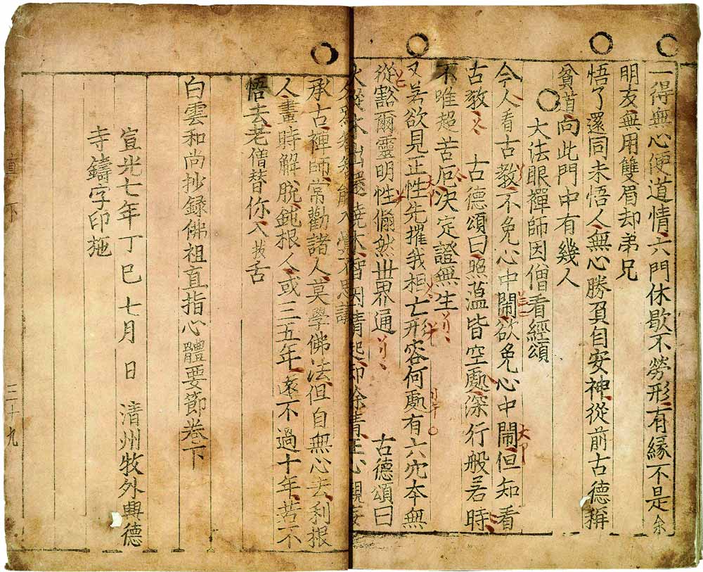
Type characters cast from metal (bronze) are developed in China, Japan and Korea. The oldest known book printed using metal type dates back to the year 1377. It is a Korean Buddhist document, called Selected Teachings of Buddhist Sages and Seon Masters.
Jikji - first book printed using movable type

Fifteenth century

Even though woodcut had already been in use for centuries in China and Japan, the oldest known European specimen dates from the beginning of the 15th century. Woodcut is a relief printing technique in which text and images are carved into the surface of a block of wood. The printing parts remain level with the surface while the non-printing parts are removed, typically with a knife or chisel. The wood block is then inked and the substrate pressed against the wood block. The ink that is used is made of lampblack (soot from oil lamps) mixed with varnish or boiled linseed oil.
Books are still rare since they need to be laboriously handwritten by scribes. The University of Cambridge has one of the largest libraries in Europe – constituting of just 122 books.
In 1436 Gutenberg begins work on a printing press. It takes him 4 years to finish his wooden press which uses movable metal type. Among his first publications that get printed on the new device are bibles. The first edition has 40 lines per page. A later 42-line version comes in two volumes.
A printer operates a Gutenberg press
In 1465 the first drypoint engravings are created by the Housebook Master, a south German artist. Drypoint is a technique in which an image is incised into a (copper) plate with a hard-pointed ‘needle’ of sharp metal or a diamond point.
In their print shop in Venice John and Wendelin of Speier are probably the first printers to use pure roman type, which no longer looks like the handwritten characters that other printers have been trying to imitate until then.
In 1476 William Caxton buys equipment from the Netherlands and establishes the first printing press in England at Westminster. The painting below depicts Caxton showing his printing press to King Edward IV.
William Caxton shows his printing press to King Edward IV
That same year copper engravings are for the first time used for illustrations. With engravings, a drawing is made on a copper plate by cutting grooves into it.
By the end of the century, printing has become established in more than 250 cities around Europe. One of the main challenges of the industry is distribution, which leads to the establishment of numerous book fairs. The most important one is the Frankfurt Book Fair.

Sixteenth century

Aldus Manutius is the first printer to come up with smaller, more portable books. He is also the first to use Italic type, designed by Venetian punchcutter Francesco Griffo.
In 1507 Lucas Cranach invents the chiaroscuro woodcut, a technique in which drawings are reproduced using two or more blocks printed in different colors. The Italian Ugo da Carpi is one of the printers to use such woodcuts, for example in Diogenes, the work shown below.
Chiaroscuro woodcut by In 1525 the famous painter, wood carver and copper engraver Albrecht Dürerpublishes ‘Unterweysung der Messung’ (A Course on the Art of Measurement), a book on the geometry of letters.
The ‘Historia Veneta’ (1551) is one of the many books of Pietro Bembo, a Venetian scholar and cardinal who is most famous for his work on the Italian language and poetry. The Bembo typeface is named after him.
Christophe Plantin is one of the most famous printers of this century. In his print shop in Antwerp, he produces fine work ornamented with engravings after Rubens and other artists. Many of his works as well as some of the equipment from the shop can be admired in the Plantin-Moretus museum.

Seventeenth century

Plantin is also the first to print a facsimile. A facsimile is a reproduction of an old book, manuscript, map, art print or other item that is as true to the original source as possible.
The word ‘not’ is accidentally left out of Exodus 20:14 in a 1631 reprint of the King James Bible. The Archbishop of Canterbury and King Charles I are not amused when they learn that God commanded Moses “Thou shalt commit adultery”. The printers, Robert Barker and Martin Lucas, are fined and have their printing license revoked. This version of the Bible is referred to as The Wicked Bible and also called the Adulterous Bible or Sinner’s Bible.
Wicked Bible
In Paris, the Imprimerie Royale du Louvre is established in 1640 at the instigation of Richelieu. The first book that is published is ‘De Imitatione Christi’ (The Imitation of Christ), a widely read Catholic Christian spiritual book that was first published in Latin around 1418.
In 1642 Ludwig von Siegen invents mezzotint, a technique to reproduce halftones by roughening a copper plate with thousands of little dots made by a metal tool with small teeth, called a ‘rocker’. The tiny pits in the plate hold the ink when the face of the plate is wiped clean.
The first American paper mill is established in 1690.

Eighteenth century

In 1710 the German painter and engraver Jakob Christof Le Blon produces the first engraving in several colors. He uses the mezzotint method to engrave three metal plates. Each plate is inked with a different color, using red, yellow and blue. Later on, he adds a fourth plate, bearing black lines. This technique helped form the foundation for modern color printing. Le Bon’s work is based on Newton’s theory, published in 1702, which states that all colors in the spectrum are composed of the three primary colors blue, yellow and red.
William Caslon is an English typographer whose foundry operates in London for over 200 years. His Caslon Roman Old Face is cut between 1716 and 1728. The letters are modeled on Dutch types but they are more delicate and not as monotonous. Caslon’s typefaces remain popular, digital versions are still available today.
Caslon Pro RegularThe Gentleman’s Magazine is published for the first time in 1731. It is generally considered to be the first general interest magazine. The publication runs uninterrupted until 1922.
The first general interest magazine
In 1732 Benjamin Franklin establishes his own printing office and becomes the publisher of the Pennsylvania Gazette. Among his publications Poor Richard’s Almanac becomes the most famous.
Alois Senefelder invents lithography in 1796 and uses it as a low-cost method for printing theatrical works. In a more refined form lithography is still the dominant printing technique today.
Another famous person from this era is Giambattista Bodoni who creates a series of typefaces that carry his name and that are still frequently used today. They are characterized by the sharp contrast between the thick vertical stems and thin horizontal hairlines.

Bodoni Book

Nineteenth century

In 1800 Charles Stanhope, the third Earl Stanhope, builds the first press which has an iron frame instead of a wooden one. This Stanhope press is faster, more durable and it can print larger sheets. A few years later another performance improvement is achieved by Friedrich Gottlob Koenig and Andreas Friedrich Bauer who build their first cylinder press. Their company is still in existence today and is known as KBA.
In 1837 Godefroy Engelmann is awarded a patent on chromolithography, a method for printing in color using lithography. Chromolithographs or chromos are mainly used to reproduce paintings. The advertisement below is from the end of the century and shows what can be achieved using this color printing technique. Another popular technique is the photochrom process, which is mainly used to print postcards of landscapes.
A chromolithograph from around 1890
The Illustrated London News is the world’s first illustrated weekly newspaper. It costs five pence in 1842. A year later Sir Henry Cole commissions the English painter John Callcott Horsley to do the artwork of (arguably) the first commercial Christmas card. Around 1000 cards are printed and hand-colored. Ten of these are still in existence today.
The oldest mass-produced Christmas card
Around the same time the American inventor Richard March Hoe builds the first lithographic rotary printing press, a press in which the type is placed on a revolving cylinder instead of a flatbed. This speeds up the printing process considerably.
Hoe rotary press
The Czech painter Karel Klíč invents photogravure in 1878. This process can be used to faithfully reproduce the detail and continuous tones of photographs.
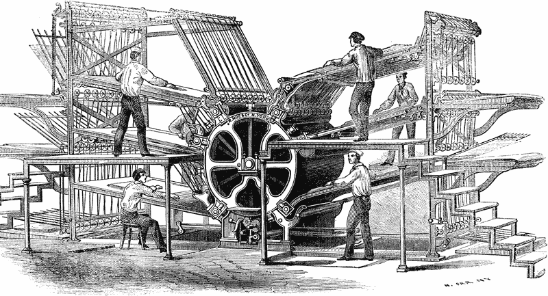
In typesetting Ottmar Mergenthaler’s 1886 invention of the Linotype composing machine is a major step forward. With this typesetter, an operator can enter text using a 90-character keyboard. The machine outputs the text as slugs, which are lines of metal type.
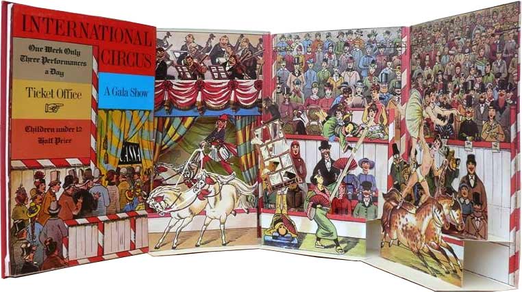
Lothar Meggendorfer’s International Circus is a nice example of the quality that could be achieved in those days. This pop-up book contains six pop-up scenes of circus acts, including acrobats, clowns, and daredevil riders.
International Circus - popup book
In 1890 Bibby, Baron and Sons build the first flexographic press. This type of press uses the relief on a rubber printing plate to hold the image that needs to be printed. Because the ink that is used in that first flexo press smears easily, the device becomes known as Bibby’s Folly.

Twentieth century

In 1903 American printer Ira Washington Rubel is instrumental in producing the first lithographic offset press for paper. In offset presses a rubber roller transfers the image from a printing plate or stone to the substrate. Such an offset cylinder was already in use for printing on metals, such as tin.
In 1907  the Englishman Samuel Simon is awarded a patent for the process of using silk fabric as a printing screen. Screen printing quickly becomes popular for producing expensive wallpaper and printing on fabrics such as linen and silk. Screen printing had first appeared in China during the Shang Dynasty (960–1279 AD).
A few of the new press manufacturers that appear on the market are Roland(nowadays known as Man Roland) in 1911 and Komori Machine Works in 1923.
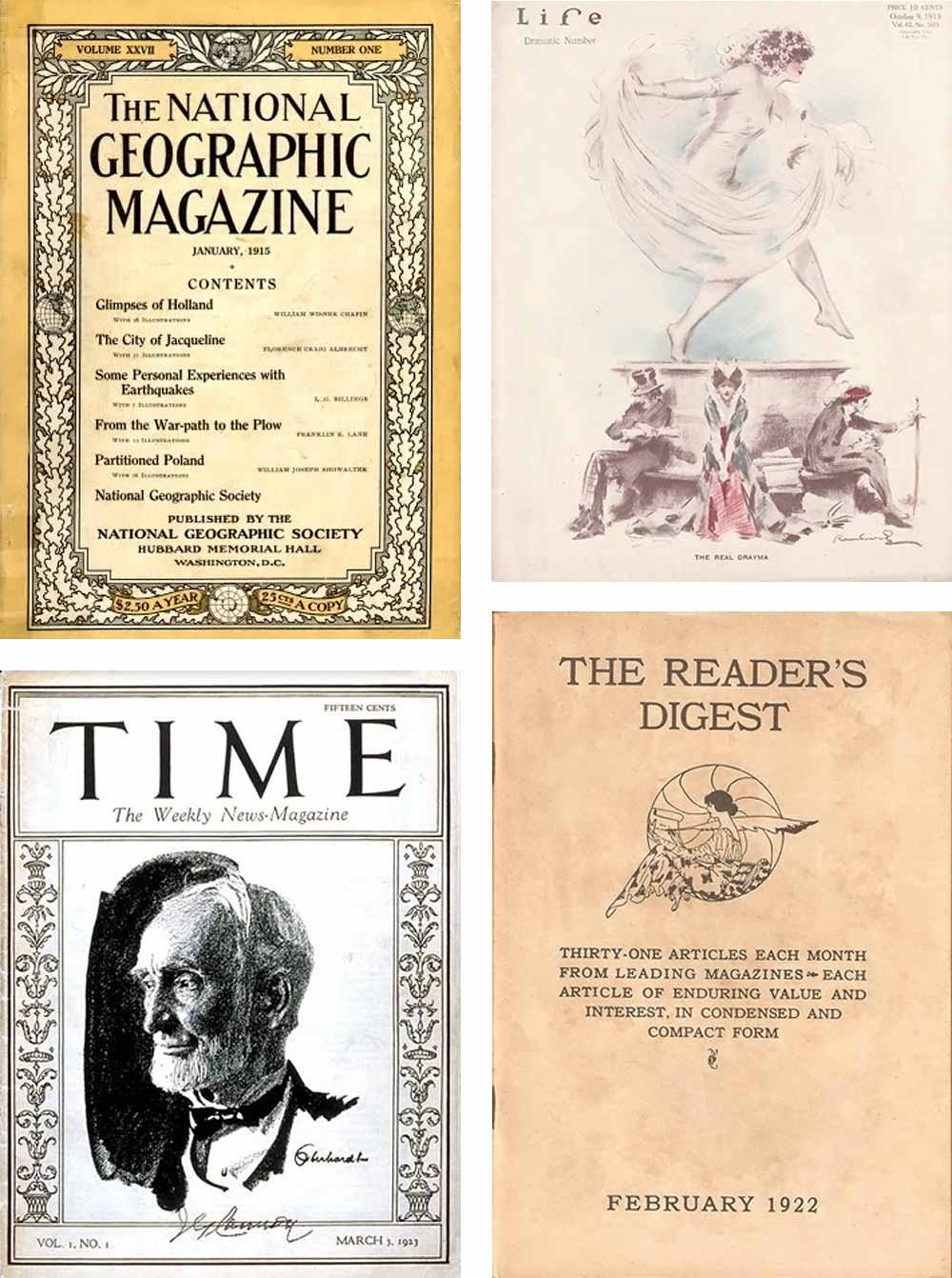
In 1915 Hallmark, founded in 1910, creates its first Christmas card. It is during this same era that magazines such as the National Geographic Magazine (1888), Life (1883, but focussing on photojournalism from 1936), Time (1923), Vogue (1892) and The Reader’s Digest (1920) starting reaching millions of readers.
Famous US magazines
Press manufacturer Koenig & Bauer launch the four-color Iris printing press in 1923. It can be used for printing banknotes. Over time security printing becomes one of the main focus points of the company.
The first commercially successful series of paperback books is published by Penguin Books in the UK in 1935. Earlier in 1931 German publisher Albatross Books had already tried to market a series of lower-priced books with a paper cover and glue binding. Penguin copied many of the concepts of their failed attempt, such as the use of color-coded covers.
'Ariel' from Andre Maurois
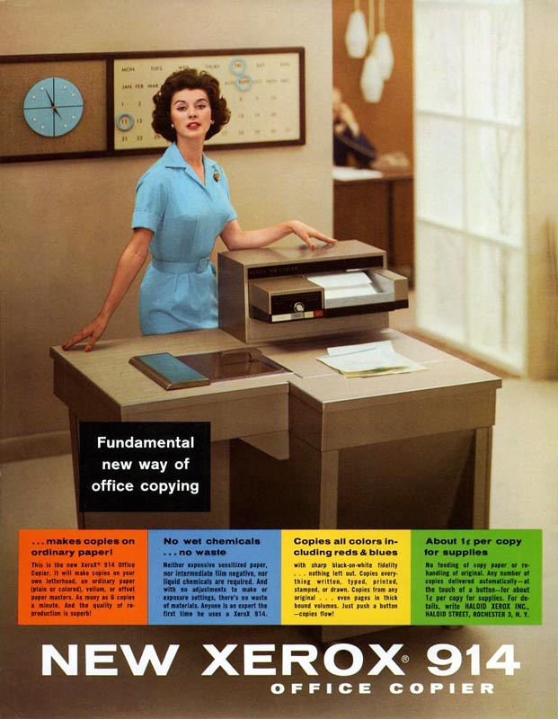
In 1938 Xerography, a dry photocopying technique is invented by Chester Carlson. The first commercial xerographic copier is introduced in 1949 but it is the 1959 Xerox 914 plain paper copier that is the breakthrough.
Xerox 914 plain paper copier
Japanese machine tool manufacturer Shinohara Machinery Company begins manufacturing flatbed letterpress machines in 1948. A popular press from that time is the Heidelberg Tiegel. The picture below shows it being demonstrated  to German finance minister Ludwig Erhard at the first drupa trade show in 1951.
drupa 1951 - Heidelberg Tiegel press
In 1967 the ISBN or International Standard Book Number started. This is a unique numeric identifier for commercial books. That same year Océ enters the office printing market with an electro-photographic process for copying documents using a special chemically-treated type of paper.
New materials like silicone make it possible for manufacturers such as Tampoprint to build more efficient presses for printing on curved surfaces. Pad printing can now be done on an industrial scale.
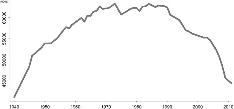
In the USA newspaper circulation reaches its highest level ever in 1973. It will remain fairly steady until a gradual decline sets in during the mid-’80s.
USA Newspaper Circulation
The first laser printers, such as the IBM 3800 and Xerox 9700, hit the market in 1975. They are prohibitively expensive but useful for applications such as cheque printing.
IBM 3800 laser printer
Desktop publishing takes off in 1985. The combination of the Apple Macintosh computer, printers and imagesetters powered by Adobe PostScript and the layout application Aldus PageMaker makes publishing more affordable.
Aldus Pagemaker 1.0
At drupa 1986 MAN Roland Druckmaschinen AG introduces its LITHOMANcommercial web offset printing press. Polar show off the POLAR Compucut, a system for computer-assisted, external generation of cutting programs with automatic transfer to the cutting machine.
The Xerox Docutech, launched in 1990, combines a 135 page-per-minute black & white xerographic print engine with a scanner and finisher modules. It is arguably the first affordable print-on-demand publishing system.
In 1992 Australia is the first country to use polymer banknotes for general circulation.
Australia issues the first polymer banknote in general circulation
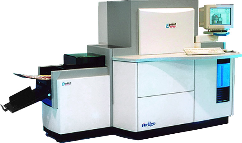
Digital printing takes off in 1993 with the introduction of the Indigo E-Print 100(shown below) and Xeikon DCP-1.
Indigo E-print 1000

Twenty-first century

Offset presses still evolve incrementally. Two prime examples are the introduction of the KBA Cortina, a waterless web press for newspapers and semi-commercials, in 2000 and that of the giant Goss Sunday 5000, the world’s first 96-page web press, in 2009.
96 page hig-speed short-grain web press
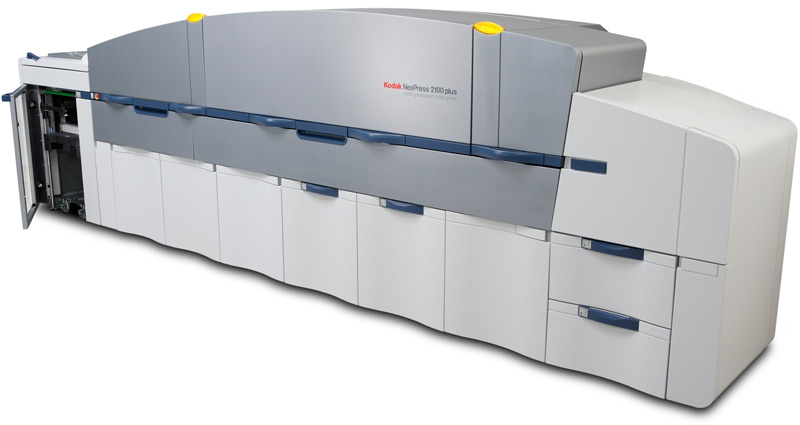
Bigger changes happen in digital printing with machines that evolve as fast as the companies that produce them. Take the NexPress for example. It is initially a joint development from Heidelberg and Kodak, later taken over completely by Kodak.
Kodak Nexpress
One of the bigger players in the market is HP, especially after its acquisition of Indigo in 2001. Other big players in the market are Konica Minolta with the Bizhub digital presses and Canon with its Imagepress range. Part of Canon’s growth is through its acquisition of Océ in 2009.
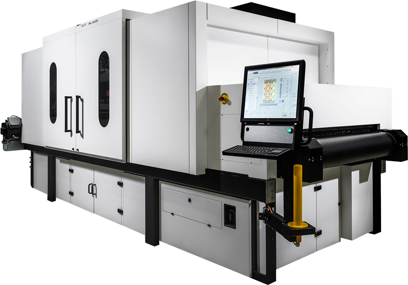
One area of the market that evolves quickly is that of large format inkjet presses for the sign & display market. Inkjet technology also starts making inroads in the packaging industry. At the 2016 edition of drupa the EFI Nozomi C18000, HP PageWide C500 and Durst Rho 130 SPC (shown below) are all presses optimized for printing on corrugated packaging board.
Durst Rho 130 SPC digital press
Source: https://www.prepressure.com/printing/history