Showing posts with label Spot Color. Show all posts

Wednesday, October 17, 2018

Adobe Photoshop: Working with Spot Color Channels

Updated for CC Jun 30, 2016
Let’s face it, most of us set type over our Photoshop images using a page layout program (i.e., Adobe InDesign) or an illustration program (i.e., Adobe Illustrator). This allows us to easily define and use a spot color, and has the added benefits of crisp edges on the type, allows knock out of the underlying image and fully editable type. But what if you want to create a spot color in Photoshop and apply it to the type or other graphic elements? Can you do it? Sure, but it’s a bit confusing. Let’s see if I can help.
Let’s start with some basic concepts. Spot colors, stored in Color Libraries in Photoshop, are pre-mixed inks that are used in addition to, or instead of, CMYK inks. We typically use spot colors when we need to be sure that we are getting the same color every time (i.e., a corporate color) or to print a color that is outside the CMYK gamut. Spot color is intended for images that will be printed to film, not for images printed on desktop printers or for electronic distribution.

Define a Spot Color Channel

First you need to define one, or more, spot colors in your Photoshop document.
  1. Window > Channels.
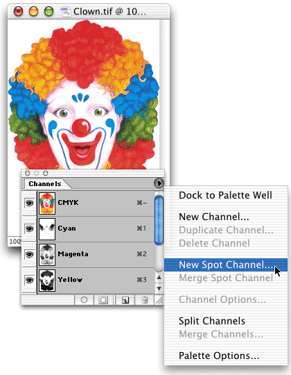
  2. Pick New Spot Channel from the panel pop-up menu in the top right corner.
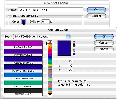
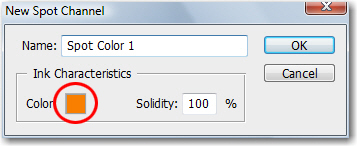
  3. Click the color box to open the Color Picker.
    Adobe Photoshop
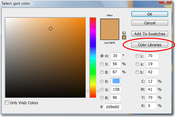
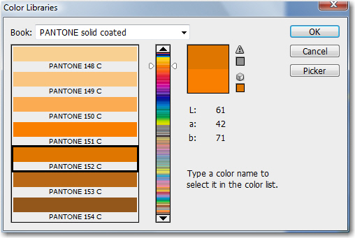
  4. Select the Color Libraries button.
    Adobe Photoshop
  5. Pick your custom color system from the Book list. In my example, I choose PANTONE solid coated. Just type in your color namethere is no text box for the number in the dialog box, but it still works. I typed 152.
    Adobe Photoshop
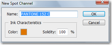
  6. When you see your color appear, click OK.
    Adobe Photoshop
  7. Change the Solidity to 100%, click OK. (Solidity lets you simulate on‑screen the density of the printed spot color but has no effect on the printed separations. A value of 100% simulates an ink that completely covers the inks beneath (such as a metallic ink); 0% simulates a transparent ink that completely reveals the inks beneath (such as a clear varnish).).
  8. Your spot color channel is added to the Channels panel—don’t worry that it just looks white!

Applying Spot Color

Because spot colors print on top of a fully composited image, you may need to remove the base color so that it doesn’t show through a semi-transparent spot-ink color when printing. We’ll handle that with a cut and paste sequence as we apply the color.
  1. Tap the letter D on the keyboard to reset the default colors to Black and White.
  2. Select the area where you would like to use a spot color. In my example, I selected a border around the image. Make sure you are on the same layer as the selected pixels, in my case, that’s the Background layer.

    Adobe Photoshop
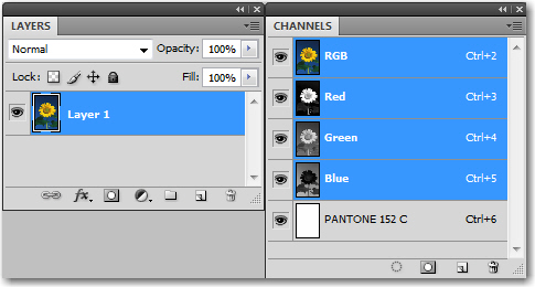
  3. Select the composite channel in the Channels panel. (If you are working in RGB, click the letters RGB in channels panel. For CMYK, click the letters CYMK; for grayscale, click the word Gray.)
    Adobe Photoshop
  4. Choose Edit > Cut to cut the selected pixels to the clipboard.
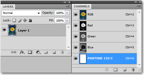
  5. Select the Pantone 152 channel in the Channels panel.
    Adobe Photoshop
  6. Choose Edit > Paste to paste the selected pixels into the spot color channel.

    Adobe Photoshop
  7. Ah ha! Now you know this is working.

Applying Solid and Screened Areas of your Spot Color

If you just need a color block, like the one above, you can also apply your spot by simply filling an area with black, while your color channel is active. Solid black will give you 100% opacity of your spot. Less than 100% black will give you a tint.
  1. Tap the letter D on the keyboard to reset the default colors to Black and White.
  2. Make a selection (mine is a wave).
  3. Click on the Composite channel in the Channels panel. (See step 3 above.)
  4. Press Backspace or Delete to remove the pixels within the selection.

    Adobe Photoshop
  5. Select the Pantone 152 channel in the Channels panel.
  6. Press ALT+Backspace (Mac: Option+Delete) to fill the selection. Because the spot color channel is active, the result is 100% of the spot color.
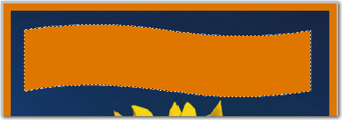
    Adobe Photoshop
  7. Pick Edit > Undo so that we can try adding a tint.
  8. Use the Color panel to define a 50% black foreground color.
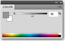
    Adobe Photoshop
  9. Press ALT+Backspace (Mac: Option+Delete) to fill the selection. There’s your tint: filling with 50% black on the spot color channel results in a 50% tint of the spot.
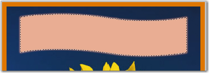
    Adobe Photoshop

Applying your Spot Color to Text

I know we are mid-way through 2016, and that Photoshop has had editable type layers for close to 20 years, so you may need to read the next sentence two or three times to fully comprehend it. Spot color channel text is not editable. Really. So type carefully. Proof carefully. Or go work in Illustrator or InDesign. If you chose to apply spot color to type in Photoshop, you are going to need to use a type mask if you want to apply a spot color to text.
  1. Press the letter D on the keyboard to reset the default colors to Black and White.
  2. Select the Type tool and click where you want to add text. A red mask appears over the artwork, and you have a blinking insertion point cursor.

    Adobe Photoshop
  3. In the Options bar, set your typeface, style and size.

    Adobe Photoshop
  4. Type in your text. (I added a warp to match the wave shape.)
  5. Move the Type tool off the text to gain temporary access to the Move tool. Drag to position the text. Don’t actually switch to the Move tool, or you will commit the Type edits.

    Adobe Photoshop
  6. When you deselect, it’s done, so make sure you are satisfied before you tap Ctrl D (Mac: Cmd D) to drop your selection.

    Adobe Photoshop

Printing your Spot Colors

My best advice on any printing issues is to talk with your commerical printer or print service provider. They can tell you exactly what you need to do to output the job. If you are looking for a good online resource, check out Corey Barker’s excellent post on Planet Photoshop: http://www.planetphotoshop.com/working-with-spot-color-channels.html.

Working with Spot Color Channels

Spot colors can be used with CMYK or Multichannel documents intended for print to add additional colors, create “bump plates,” and to control varnishes. They can add a bunch to your printing bill. Or they can reduce your print costs – think about using black and a single spot color for some projects.
Spot color channels are designed to provide a channel for additional inks to be used in commercial printing. The location in the image where the ink should be applied is stored in the spot channel. A separate printing plate is generated, and an additional run through the press is required. This usually increases the cost of the print job.
If you need to ensure an exact match for a corporate logo, you may want to use a spot color. Another typical use is extending the color range of an image beyond those that can be produced using the CMYK inks. Neon and metallic colors can be added with spot channels. Spot channels can also be used to identify areas of an image over which a varnish will be applied.
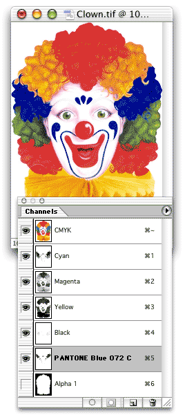
A spot channel is added to the image – and to the Channels palette – using the Channels palette menu command New Spot Channel. If you have an active selection in the image, the spot channel will automatically be created from it. With no active select, an empty channel is created.
The command opens the New Spot Channel dialog box. In the dialog box, click the color swatch to open the Color Picker. Spot colors are typically selected from a Custom book in the Color Picker.
The name of the color selected is automatically updated in the New Spot Channel dialog box, as is the swatch. Solidity refers to how the spot channel will be viewed on screen – it has no effect on printing at all. When set to 100% solidity, the spot color will be completely opaque on screen in areas where it will be printed at 100% ink density. (Lesser tints of the ink, identified in the channel by gray values under 100%, will be proportionately reduced in opacity.) Setting the solidity to 0%, however, does not make the spot color transparent. Rather, it simply reduces the opacity of the spot color areas. Solidity has no effect when the spot channel is the only visible channel.
The Solidity field is previewed live in the image (if you’re creating the spot channel from a selection), so you can experiment with various settings before closing the dialog box. You can also re-open the spot color options to change the setting by double-clicking the spot channel in the Channels palette.
There are three basic techniques for identifying where a spot color will be applied:
• Make a selection in the image before using the New Spot Channel command.
• Create the new spot channel, then use Photoshop’s various tools and commands to create a grayscale representation of the spot color.
• Make a selection with one or more channels active and copy, then paste into the spot channel.
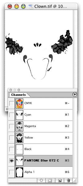
Spot channel information does not appear in the Layers Palette. You edit the spot color information by editing the spot channel. Remember that the spot channel is a grayscale representation (even when the Preferences are set to show it in color). Paint with shades of gray, not the spot color itself, in the spot channel. Painting with black produces areas of 100% spot color tint.
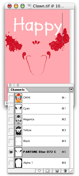
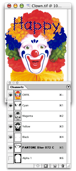
To show on screen where the spot color will print, the spot channel must be visible in the Channels palette. It can be made visible by itself for easy editing (as is shown above), or it can be shown in conjunction with the composite channel (or any of the color channels).
Spot channels don’t interact with layers, so adding a type layer in a spot color is out of the question. Instead, create a type mask in the spot channel and fill the selection with black. The Type tool will automatically enter type mask mode when a spot color channel is active in the Channels palette.
For 100% coverage of the spot color, make sure to fill the type selection with black.
Images containing spot channels should be placed into a page layout program in the DCS 2.0 file format. While the advanced TIFF format supports spot colors, your page layout program might not recognize the additional channels or generate color separations from them.
I’ve been asked in the past why spot channels are available for RGB and L*a*b color modes if they’re intended for print. Remember that conversion to CMYK color mode often happens late in a work flow. You can add the spot color channels at any time – they’re maintained when you do your final pre-print color conversion.
In addition, you can use a spot channel as an interim step in an RGB image. Create the spot channel, apply the color. Since the spot color is in a separate channel, it is protected while you continue editing and adjusting the rest of the image. Later, use the Channels palette menu command Merge Spot Channel to integrate that channel into the RGB channels.
Source: http://planetphotoshop.com/working-with-spot-color-channels.html

Thursday, March 15, 2018

Spot vs. Process Color

Spot Colors

Colors created without screens or dots, such as those found in the PANTONE MATCHING SYSTEM®, are referred to in the industry as spot or solid colors. From a palette of 18 basic colors, each of the spot colors in the PANTONE MATCHING SYSTEM is mixed according to its own unique ink mixing formula developed by Pantone. You probably mixed yellow and blue paint to get green in your youth. Creating a PANTONE Spot Color is similar in concept, but with the added need for precision.
The precision begins with the printing ink manufacturers who are licensed by Pantone to manufacture inks for mixing PANTONE MATCHING SYSTEM Colors. To retain their license, they must annually submit samples of the 18 basic colors for approval by Pantone. Printers can then order the colors by number or mix it themselves according to the ink mixing formula in a PANTONE® FORMULA GUIDE. A PANTONE Chip supplied with the ink and/or job ensures that the printer achieves the color desired by the customer.
The PANTONE® FORMULA GUIDE with 1,867 PANTONE PLUS Colors on coated and uncoated stock.

Each color in the System has a unique name or number followed by either a C or U. The letter suffix refers to the paper stock on which it is printed: C for Coated paper and U for Uncoated paper. Also created without screens, PANTONE metallic and pastel colors are considered part of the PANTONE MATCHING SYSTEM.
Due to the gamut of the 18 basic colors, some spot colors will be cleaner and brighter than if they were created in the four-color process described below. Spot colors are commonly used in corporate logos and identity programs, and in one, two or three-color jobs.

Process Colors

The most common method of achieving color in printing is referred to as CMYK, four–color process, 4/c process or even just process. To reproduce a color image, a file is separated into four different colors: Cyan (C), Magenta (M), Yellow (Y) and Black (K).
A color image is separated into CMYK. When printed on paper, the original image is recreated.
During separation, screen tints comprised of small dots are applied at different angles to each of the four colors. The screened separations are then transferred to four different printing plates, one for each color, and run on a printing press with one color overprinting the next. The composite image fools the naked eye with the illusion of continuous tone.
PANTONE 4–COLOR PROCESS guide set. Displays 3,010 CMYK combinations with screen tint percentages. A guide on uncoated paper is included in the set.

Process colors are represented as percentages of cyan, magenta, yellow and black. Varying the percentages offers thousands of color possibilities. When four-color process printing is used to reproduce photographs, decorative elements such as borders and graphics can be created out of process colors. This helps to avoid the added expense of an extra plate needed to print each spot color.


Converting spot colors to process colors.

Oftentimes, a spot PANTONE MATCHING SYSTEM Color is requested when creating a process-printed piece. To save money, the spot color should be evaluated to see how it will look if printed in CMYK or in ECG printing – CMYK+OGV. While some colors can be simulated well, there are many that are outside the possible color gamut for that process and will look quite different. As the quality of the resulting color conversion is very subjective, the designer can make decisions using the PANTONE COLOR BRIDGE® guide, as well as a PANTONE EXTENDED GAMUT Coated Guide.


Extended Color Gamut process colors

Extended color gamut (ECG) printing, sometimes referred to as Fixed Palette Printing, is not a new concept but is rapidly gaining in popularity. Widespread adoption has been limited until the last few years. The basic premise of ECG is adding additional base inks to traditional CMYK in order to extend the color gamut.
Pantone has adopted a formulation for ECG printing of our own by adding three base inks, Orange, Green and Violet (OGV), to the CMYK ink set. The PANTONE PLUS SERIES EXTENDED GAMUT Coated Guide has printed 7-Color process simulations of all 1,729 solid PANTONE MATCHING SYSTEM Colors (with an aqueous finish). This enables printers to more accurately match and reproduce a wider range of PANTONE Spot Colors.
The PANTONE® COLOR BRIDGE™ guide displays each PANTONE MATCHING SYSTEM Color and its corresponding simulation in CMYK.

source: https://www.pantone.com/spot-vs-process-color